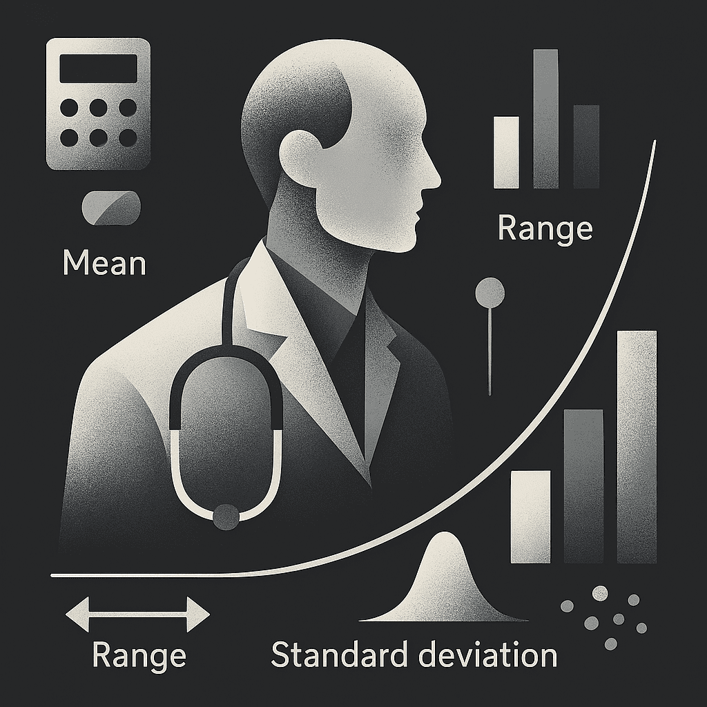
Averages and Spread in Data
Understanding What Medical Data Is Telling You
How do we describe a bunch of numbers in a meaningful way?
Whether you’re looking at heart rates, lab results, or hospital stay lengths, you’re working with data, and to make sense of it, we need a way to summarize it. That’s where measures of central tendency and variability come in.
And here’s the good news:
You do not need to calculate any of this by hand. Software like R, SPSS, SAS, or Python will handle the math. Your job is to know what the results actually mean.
What’s “Typical”? Let’s Talk Averages
We usually want to know what’s typical in our data and what value represents the general trend? There are three ways we do that:
Mean (a.k.a. the average): You add up all the values and divide by how many there are. Simple, right?
It works great when your data is nicely balanced.
But if you’ve got extreme values, like a patient who stayed 60 days in the hospital while most stayed 3, it can throw things off.
Median: This is the middle value when your data is sorted.
It is your best friend when the data is skewed or has outliers.
If most hospital stays are under 5 days but a few patients stayed weeks, the median gives you a more realistic summary.
Mode: The value that shows up the most.
This one’s especially useful for categorical data like the most common blood type or diagnosis.
How Much Do Values Vary?
Once you know what’s “typical,” the next question is: How spread out are the rest of the values?
Range: Just the difference between the highest and lowest numbers.
It’s easy to understand but doesn’t tell you much about what’s happening in between.
Standard Deviation: This one tells you how much the values typically deviate from the mean.
A small standard deviation? The data is clustered close to the average.
A large one? Things are all over the place.
Variance: It’s basically the square of the standard deviation.
You probably won’t use it in conversation, but software needs it for calculations.
So, What Do You Actually Need to Know?
Forget the formulas. Here’s what really matters when you’re looking at these numbers in a paper or a dataset:
Is the mean or the median a better summary of this data?
How spread out are the values?
Are there outliers pulling the results in one direction?
Which number gives the most honest snapshot of what’s going on?
Key Takeaways
Mean is great unless your data has outliers.
Median is your go-to when things are skewed.
Mode works best for categories.
Standard deviation tells you how consistent or variable your data is.
And again, you won’t be doing the math. You’ll be interpreting what the software gives you.
Up Next:
Now that you know how to summarize your data, we’ll look at how it’s shaped—from perfect bell curves to heavily skewed tails—and why that shape matters in medical research.